The Bright Side of AI: Clique ✱ App Case Study
Today, we, as digital product designers, have a lot to think about. Artificial intelligence has come into our lives, bringing new opportunities that were hard to imagine just a few years ago. In this article, I want to share my observations on how AI is changing familiar design patterns, using the example of my work on the project Clique.
How It All Started
As is often the case, my main task in this project was to translate the founders’ ideas into design language. It wasn’t just about creating interfaces. I had to rethink the visual language and explore new concepts and solutions. I’ll be honest — we went through several iterations, and in this article, I want to share the conceptual insights, not the final product version.
What's Clique?
Clique is an AI-powered service that helps users find similar thoughts from others or even answers to their own questions by recording their reflections. Communication within the platform happens exclusively between people whose thoughts match — determined by the AI. Users can discuss ideas, expand on each other’s thoughts, or simply offer support. What starts as a personal journal of reflections evolves into a shared, social experience.
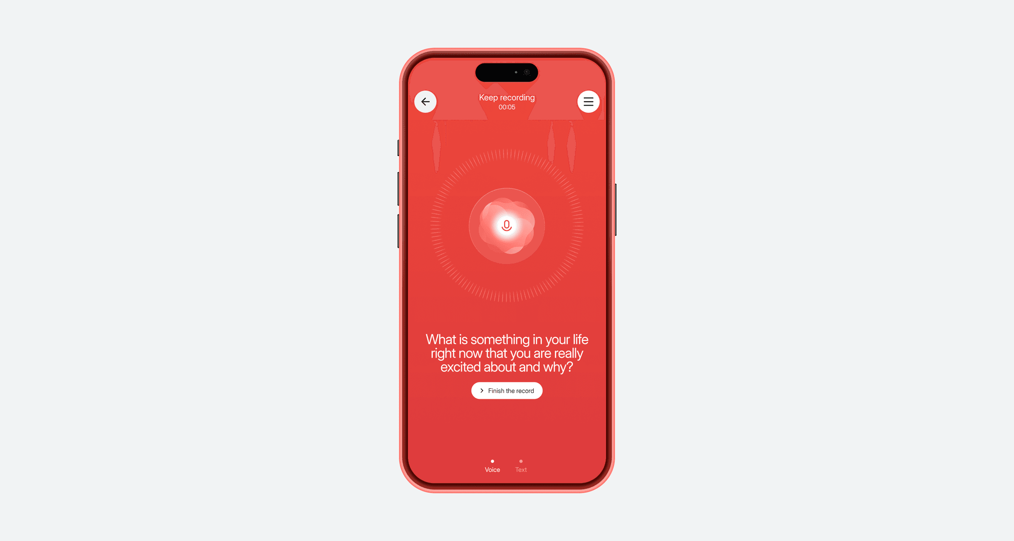
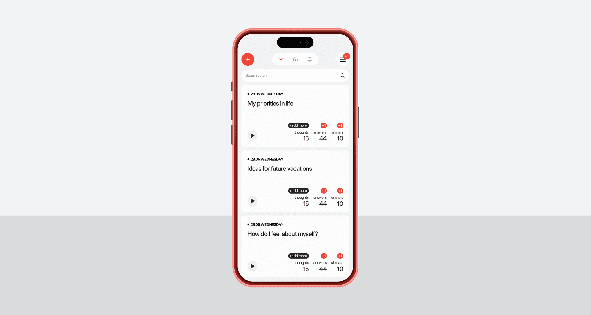
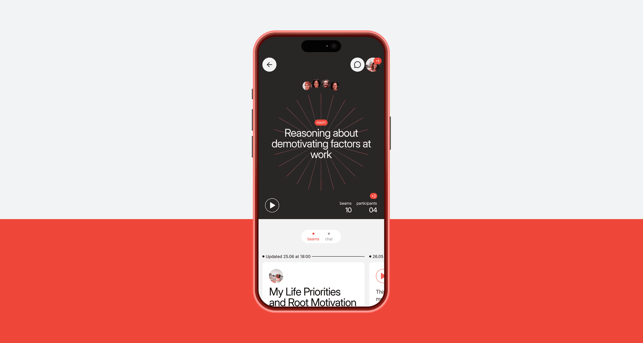
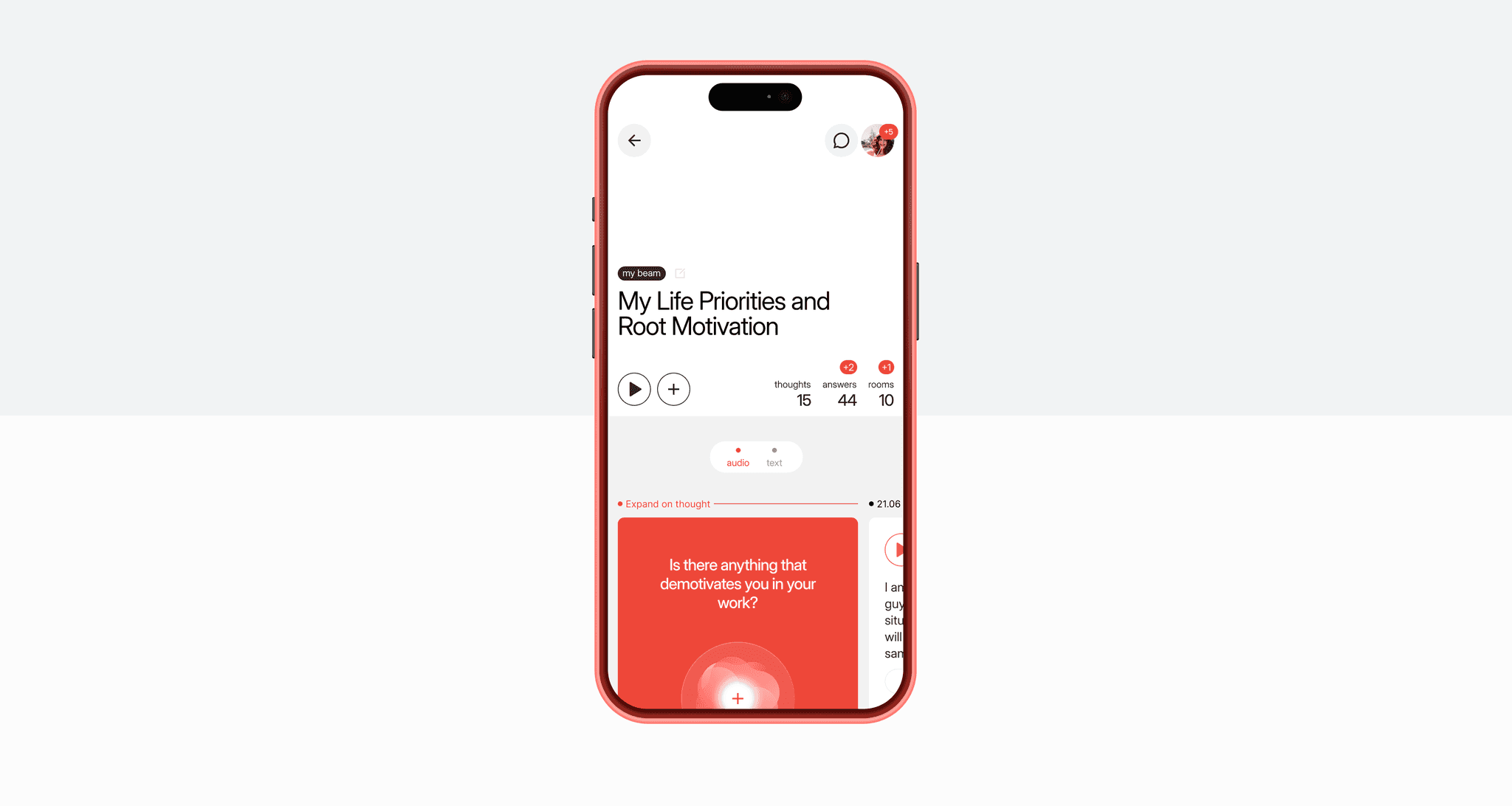
Everything begins with a thought. Users can record their ideas in text or voice. Thoughts on a specific topic are grouped into Beams (like “light beams”). Each thought can be matched with similar ones from other users, and there’s also the option to receive feedback from an AI therapist. This makes possible what we’ve struggled with for years in social media: solving the chicken-and-egg problem. Even if the platform lacks other users, no one is left alone with a limited algorithm.
Currently, Clique AI finds matches at the level of individual thoughts, but in the future, it plans to enable matching on the full Beam level.
From what I’ve observed, AI makes content more dynamic. Content doesn’t just wait on servers, waiting for someone to read it — it evolves over time. A thought that’s been expanded upon can significantly change, gaining new layers of meaning. AI allows for a much deeper analysis of this process, offering entirely new ways to work with context.
The Founders’ Vision
The project founders, Roman Mishiev and Denis Kukoyaka, came to me with a clear vision.
They believe that AI is not just a tool for creating isolated human-computer interactions but rather a way to connect people and bring their experiences together.
During one of our conversations with Roman, we came to the idea that Clique should become a large database of human experiences, where AI helps organize it and make it accessible intuitively.
Users don’t have to worry about phrasing the perfect query, filling out forms, or organizing knowledge — AI takes care of that. This is how we came up with the slogan: “The Bright Side of AI”.
Product Metaphors
From the start, we knew that users should be able to record their thoughts both in audio and text formats. This led to another metaphor: “Imagine you have a smart voice recorder that can support, advise, and respond using the voices of people you find interesting.” This made me think of Agent Cooper from Twin Peaks — perhaps he would have understood himself better if his recorder could respond!
Beam is a way to shed light on something dark and unknown. Imagine shining a flashlight in a vast dark space. Eventually, your beam intersects with beams from other people, gradually illuminating more and more of the space. That’s how Clique works.
Audio Interfaces
Visual Storytelling and the Landing Page
Clique website
The first is Edouard Boubat’s “Rémi écoutant la mer, Paris, 1995”. It shows a boy listening to a seashell with his eyes closed. Just like our users, he is listening to himself, finding inner peace.
The second photo, by an unknown author, shows a girl catching soap bubbles. For me, this also captures the feeling of the service, pushing you to start using it, because important thoughts can disappear like bubbles if not recorded.
The concept of the landing page was built around my favorite structure: Why? How? What? But with an added twist — thoughts on the page reveal themselves gradually. This emphasizes the nature of the service, where ideas emerge slowly and need time to be understood.
On the first screen, there’s no big, bold headline. Only when the user starts scrolling does it gently appear. This approach helps maintain a calm atmosphere and avoids overwhelming the visitor with too much information. The goal here is to invite them into a dialogue with themselves.
Currently, the service is available as an app on all platforms. This project was a fascinating experience for me, allowing me to rethink how AI can change our interactions with interfaces. It reinforced my belief that as designers, we shouldn’t just be creating soulless buttons. Instead, we should strive to design visual elements that convey emotion and meaning, because that’s ultimately what matters most.
Thank you for reading!
Victor


