What is ✶ ROFI Design? how I worked according to these principles with the Osmos project
Modern designers frequently encounter the impact of product metrics on their work ● Numbers, much like water wearing down stones, make design more mainstream ● Often, this process strips away what is called the soul of the design. It might seem foolish to resist this trend, considering that, in one way or another, we as designers do not work for ourselves but for the business and large user groups ● But how are we supposed to discover new solutions and create truly interesting things? Everything has its time!
I have worked extensively with both startups and corporations ● Over time, I've realized that projects at different stages of their lifecycle require completely different design approaches. It makes sense that for a steadily growing project, reliable methods and data-based solutions are often applied ● But is it logical to be conservative at the beginning? In my opinion, no. The most crucial aspect is the accurate reflection of the idea.
Many entrepreneurs may genuinely wish to apply a data-driven approach to their design at the very earliest stage. However, more often than not, it's premature for them to do so due to the lack of substantial initial data. The starting point should be to articulate the founder's ideas as precisely as possible.
What is ROFI and when to apply ROFI?
I believe the best answer to this question is a checklist. Even if your list isn't fully complete, it's worth considering ROFI for your project.
In reality, this list is not just a set of checkpoints, but rather the objectives of your work at this stage. As a designer, you need to become an extension of the founder and their team, helping them express what they have conceived. After all, their idea isn't just a copy of Spotify or Airbnb, is it?
Help founders become more precise, reveal that unique essence through your design, and guide the project from a napkin sketch to its unique value. Only after this point that you can confidently say that now the numbers come into play. Here, product teams and researchers will be able to conduct initial measurements and determine whether this unique idea is viable.
What's the difference between ROFI and MVP?
To be honest, the term MVP seems overused to me, to the point of being nearly dysfunctional. MVP is called any functioning application that barely performs some function. More often than not, an MVP is a product for which its creators apologize and which users aren't too pleased with. In the context of user experience, this approach doesn't cut it.
This is where MLP (minimum lovable product) comes in, which is an improvement — here, we consider the user experience and strive to create a product that users not just tolerate, but realy like . The ROFI approach essentially complements the search for MLP by taking into account not just the user, but also the founder.







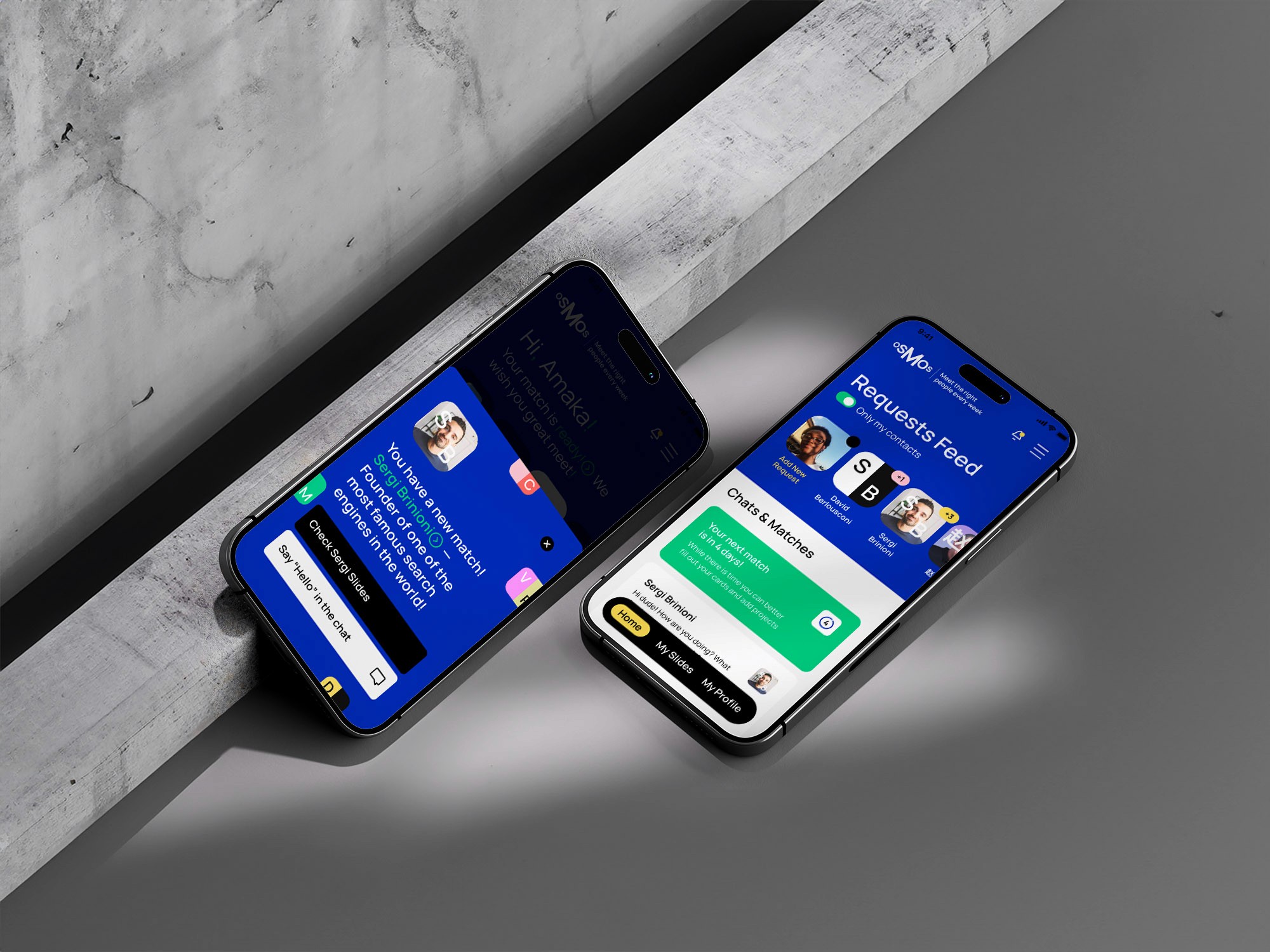
How I Used ROFI in My Work on Osmos
The first version of a product often emerges long before the product becomes what we all recognize. Changes in concepts, rethinking, and other modifications are inevitable. The task of designers at the start of a project is to explain to users, themselves, and the entire product team the key idea of the product at that moment.
To take the entire heap of thoughts, hypotheses, ideas, references, and find what unites them all, and what constitutes the most vital, most compelling aspect. And then, to define a visual identity for it.
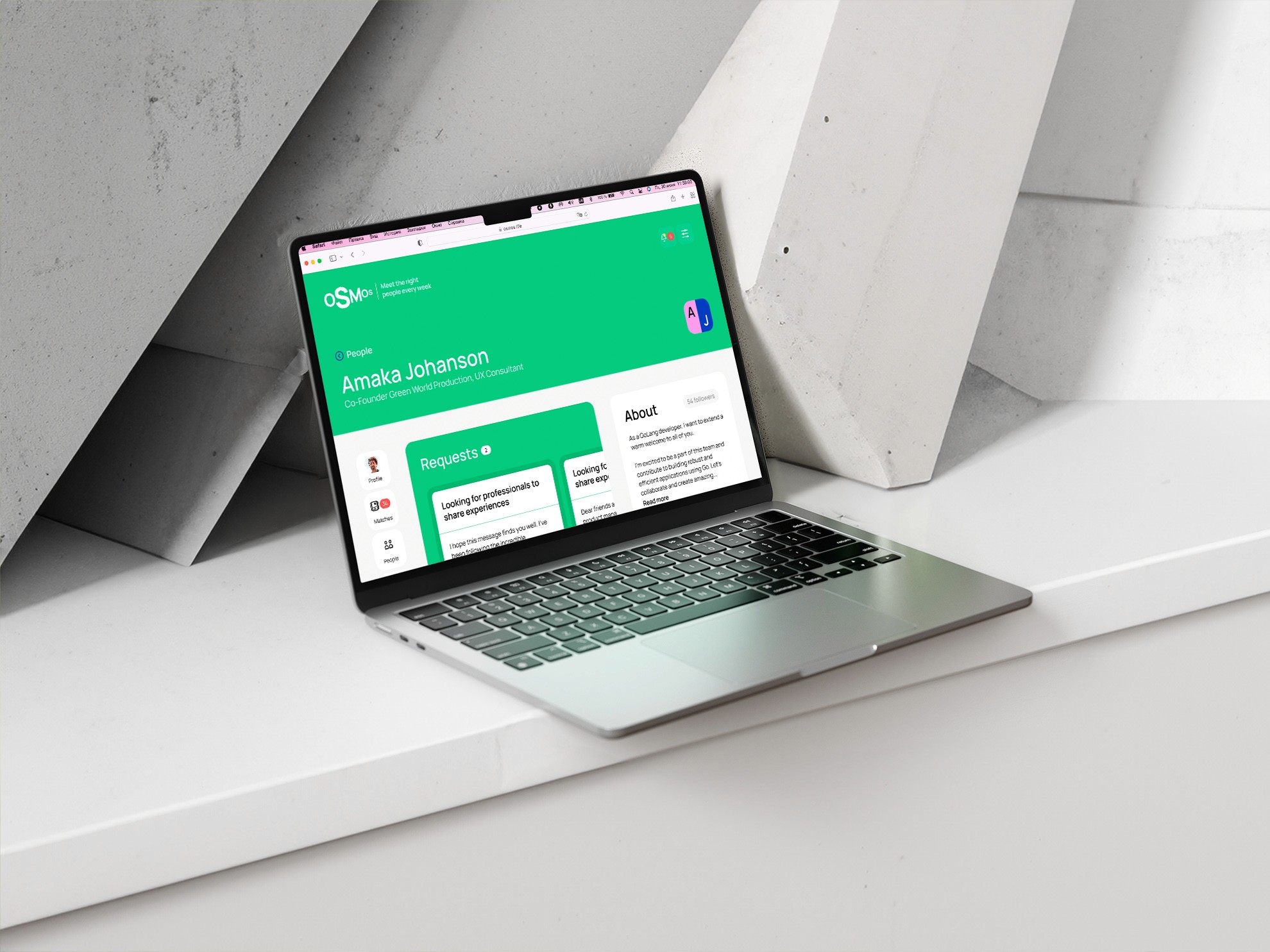
Initially, it wasn't clear for me why this service was superior to a host of other services and why people should fill out their profile on Osmos instead of LinkedIn. I wasn't aiming to get direct answers to all these questions in the first interview. After a quick discussion, I tried to capture in the layout what I heard from the team. This took just a couple of hours, but it helped us all collectively see how the product felt according to the brief description.
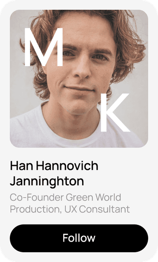
I didn't just capture the narrative. I also let my imagination run a bit, suggesting several ideas. This helped us start a more concrete conversation about the product. Interestingly, some of the solutions from this sketch were used in the release version of the product, while others are still waiting for their moment. For example, the sidebar, typography, and some color scheme decisions. After a couple of iterations working with these layouts, one of the most interesting brand elements of the product emerged — two-tone avatars with initials.
Product Metaphor
Step by step, we refined the idea and image of the product. The idea we convey is that the right connections can change your life. The problem with existing social networks is that they fail to effectively facilitate these crucial connections. This failure isn't just due to poor recommendations but also because they don't create the right context. Osmos also aims to address this issue. Through design, it seeks to establish the necessary atmosphere for such networking, while technology is used to organize the ideal match.
The context we aim to set is not an office but the last day of a great conference. A time when everyone has shed their formalities and is ready for open communication, sharing insights, and enjoying the party at the end.
The tone of communication, color palette, and brand elements — all help us break through the grim patterns of business communication.
The interface of such a service should act on a person like a glass of wine, slightly loosening them up and allowing for more freedom in communication.
Image and Description of the Service
Now that the metaphor has been defined, the next step is to decompose and detail it sufficiently. The outcome should be a service description that can clearly explain the core ideas to users.
A great method for finding the right formulations is reverse engineering. Try to imagine that the product is already complete and you need to write a press release or create a landing page for it. Write the texts and think about how well they reflect the essence and engage the reader.
Reverse engineering (also known as backwards engineering or back engineering) is a process or method through which one attempts to understand through deductive reasoning how a previously made device, process, system, or piece of software accomplishes a task with very little (if any) insight into exactly how it does so.
This approach initiated our work on the Osmos landing page, and it's how one of the founders articulated the team's belief: "We believe that the right people can change your life." This phrase aptly describes both the function and the magic of the service. Moreover, it reflects the founder's belief.
Next, we simply answered the question, "how exactly will we make it so that you find people who change your life?". The answer lies in the fact that at the core of Osmos is an AI algorithm that analyzes people's profiles for matching. And the people themselves are attracted to the platform selectively, being filtered upon entry. This way, the service's users get very relevant interlocutors.
This led to the creation of a landing page that follows Simon Sinek's classic structure of "Why? How? What?". The platform Framer was used for its implementation. The page turned out to be quite attractive and was featured in several publications, which served as good publicity for the service.
"How great leaders inspire action" Simon Sinek
The First Version of the Design
Design plays a crucial role at the start of a project. Perhaps, it's the simplest way to appeal to customers in the first seconds of acquaintance and make them want to learn more about you. I'm convinced that a good design of the first version of a product must firstly be attractive (otherwise, it interests no one), and secondly, very flexible, able to adapt to changes that will inevitably occur right after launch. It's great if you don't have to throw everything away after launching :)
This led to the idea of playing with the rhythm of the word Osmos and dynamic branding (which I am very fond of and have been practicing for quite some time). The basis for the recognition of this logo is not a specific design, but a mechanic. The user can interact with it and slightly alter it, while still remaining within the framework of our ideas. The metaphor of the logo — selecting the most suitable option, browsing through alternatives — mirrors the idea of the service exactly.
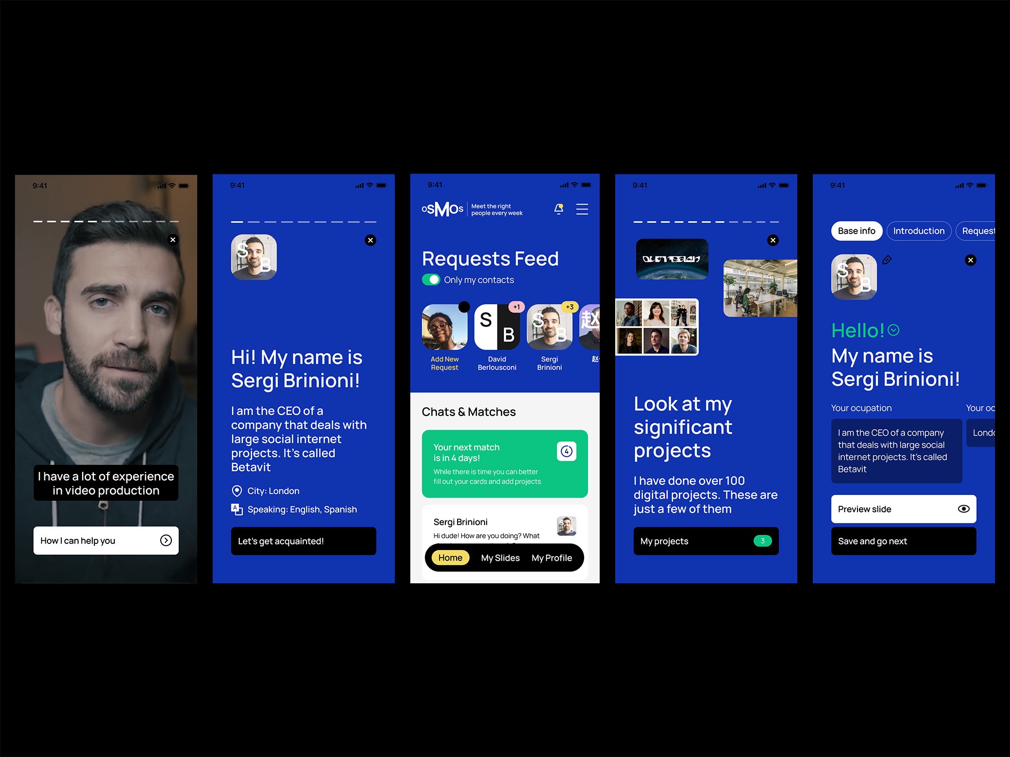
The design of the interface also rhymes with these ideas. Users can customize the colors of their inquiries, profiles, and other elements for personalization and to reflect their own image. The interface itself is built around cards and interacting with them.
At this point, the design has already undergone a number of transformations along with the service updates, but the UI and the core principles remain the same, meaning we have achieved our goal with the first version.
The Ideal User Flow
To further advance the design after launch, we made another conceptual approach, implying significant changes to the service and turning key aspects such as the profile in a completely different direction. In doing so, we tried to find the ideal user scenario, momentarily forgetting about the limitations, imperfections of our system, or the unreadiness of some technologies.
For me, it's always important to understand not where we are now, but where we want to go. Therefore, I believe that it's necessary to create concepts on a regular basis, to constantly pave the way forward. It's not a given that we'll use everything, but attempts to answer the question "what if we do it differently?" always help find good solutions. But I'll talk more about conceptualization in other articles.
1
Get the founders to answer the question, "What do you believe in?". Challenge them, ask them to imagine what the founders of their competitors believe in. What's the difference?
2
Formulate the product's metaphor. Describe it in such words that the founder would say it's exactly what's needed.
3
Only after formulating the belief and metaphor, proceed to study the experiences of other players. Now you have a clear request. Try to find examples of how an experience similar to what you need is created.
4
Create a landing page for the product. This will help you focus on what's most important.
5
Design the "ideal user flow". Imagine you can do anything. Think about how it should be in an ideal world.


